Graphs - Go beyond the default. OHLC - bar graphs
OHLC + LINEAR chart is an Open-High-Low-Close
Chart


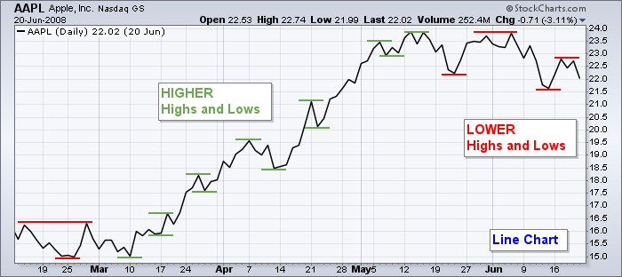
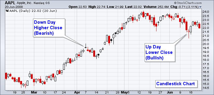
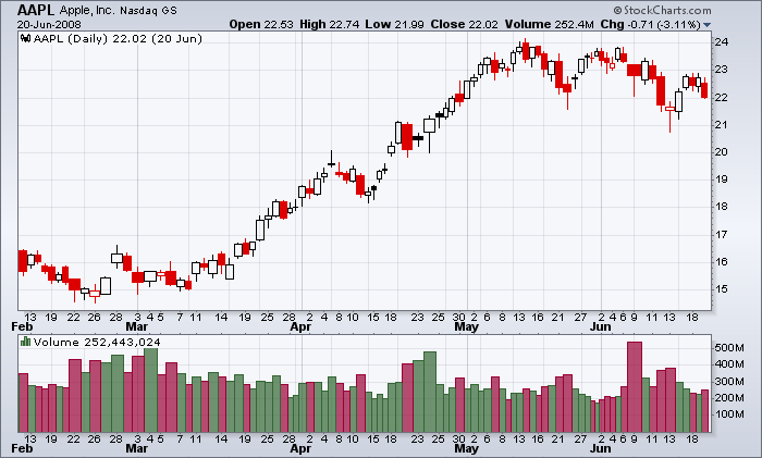
A five-month price SharpChart on line format of Apple, Inc. (AAPL)
An
OHLC chart is a type of bar chart that shows prices for each period.
Bar and candlestick charts are widely used by technical analysts because the open, high, low, and close data gives a quick overview of the day’s market psychology and trading activity.
KEY TAKEAWAYS
- An OHLC chart shows the open,
high, low, and close price for a given period.
- It can be applied to any
timeframe.
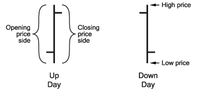
- The vertical line represents the high and low for the period, while the line to the left marks the open price and the line to the right marks the closing price. This entire structure is called a bar.
- When
the close is above the open, the bar is often colored black. When the close is below the open the bar is often colored red.
 |
| Add caption |
When the right line will be above the left,- the price rises over a period; indicating price ended higher for the day, known as an up day. This price bar is considered bullish. Bullish sentiment is present when greed for gain exceeds fear of loss and prices move higher. These bars are typically colored black
If the right line will be below the left price falls during a period.
With the price bar on the right, the OPEN is higher than the CLOSE indicating price ended lower for the day, known as a down day. This is a bearish price bar. Bearish sentiment is present when fear of loss is greater than greed for gain and prices move lower.These bars are
typically colored red.
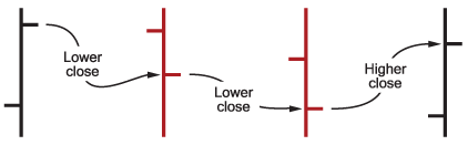
When the 'Color Prices' option is selected on the Chart Attributes workbench, the price bars will be colored black or red, depending on how a price bar's closing price relates to the previous day's closing price. If the closing price is higher than the previous day's closing price, the price bar will be black. If the closing price is lower than the previous day's, the price bar will be red. With this convention, it is possible to have a black price bar with the close being lower than the open.
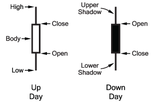
OHLC and candlestick charts show the same amount of
information, While OHLC charts show the open and close via left and right-facing horizontal lines, candlesticks show the open and close via a real body.
Interpreting OHLC Charts
Vertical Height: The vertical height of an OHLC bar is
indicative of the volatility during the period. If the line
height is great, then traders know that there's a lot of volatility and
indecision in the market.
Horizontal Line Position: The position of the left and right horizontal
lines tells technical traders where the asset opened and closed relative to its
high and low. If the security rallied higher, but the close was much lower
than the high, traders might assume that the rally fizzled toward the end of
the period. If the price fell but closed much higher than its low, selling
fizzled toward the end of the period.
If the open and
close are close together, it shows indecision, since the price couldn't
make much progress in either direction.
If the close is well above or below the open, it shows that there was
strong selling or buying during the period.
Bar Color: Typically during an uptrend, more bars will
be colored black than red. During a downtrend, more red bars than black bars
are common. This can provide information on the trend direction and its
strength. A series of large black bars, at a glance, shows a strong upward movement.
While more analysis is necessary, this information may be helpful when deciding
whether to look further into the details.
Patterns: Traders also watch for patterns to occur on
the OHLC chart. The major patterns include the key reversal, inside bar, and outside a bar. A key reversal in an uptrend
occurs when the price opens above the prior bar's close, makes a new high, and
then closes below the prior bar's low. It shows a strong shift in momentum
which could indicate a pullback is starting. A key reversal in a
downtrend occurs when the price opens below the prior bar's close, makes a new
low, and then closes above the prior bar's high. This indicates a strong shift
to the upside, warning of a potential rally.
Candlestick
Long upper or lower shadows form when the market moves significantly in a particular direction during the day and then reverses before the end of the day. As a result, long lower shadows can infer bullishness while long upper shadows can infer a bearish market
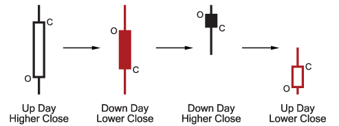
Market psychology is reflected in each of these candlestick formations in the following ways.
Up Day, Higher Close: Typically results from expectations of higher prices (greed) out weighing expectations of lower prices (fear). The length of the candlestick body shown indicates especially strong buying.
Down Day, Lower Close: Expectations of lower prices (fear) are stronger than those of higher prices (greed). As with the first candlestick, a longer candlestick body infers greater urgency of investors to sell their shares.
Down Day, Higher Close: A rare candlestick, this one begins with an opening gap up in price from the previous day's closing price but closes down for the day. A gap is defined as a price range where no trading takes place and is the result of a significant change in demand (gap up) or supply (gap down) before trading begins for the day. In this case, heavy buying at the beginning of the day reversed but still closed higher than the previous day. This is a bearish sign when it occurs well into an upward price move.
Up Day, Lower Close: Another rare candlestick, this one begins with an opening gap down in price from the previous day's closing price but closes up for the day. This price action can be considered bullish during a downward price move since initial strong selling in the day becomes exhausted and buyers push the price higher at close.
CandleVolume Charts


Comments
Post a Comment